Friday, January 30, 2009

Drop me in the water

I'm obsessed with these colors right now. The yellow/green transitioning to aqua brings to mind waterscapes. The purple/blue gives a little depth.

These are the same colors on paper from 2 different mills. You can see the difference in how the dye has diffused-- it blends more softly in the top photo, with crisper transitions in the bottom photo.


Saturday, January 24, 2009

I've been reading a memoir (research for future calligraphy pieces, you know!) by Jack London on Gutenberg, The Cruise of the Snark, about the building of a boat and consequent attempt at sailing it around the world beginning in 1907. I've never actually read anything by Jack London before, but you know what? He's quite a good writer. (who knew?). The first-person narrative is nice, showing his peculiar sense of humor. And did you know he was a socialist? I didn't (but then, I didn't know anything about him, other than that he wrote Call Of The Wild).

Anyway, I recommend it. The part I'm up to now, they've just arrived in Hawaii and are learning to surf. He surfs Waikiki and the Pipeline. In 1907. Lovely, detailed descriptions of the process of of learning to surf, its joys and dangers, and talks a bit about some of the surfers (rather, 'surf riders') who give him tips along the way. It's uncanny to hear him talk about how one guy in particular just taught himself in the past month and has gone out every day, obsessed with it and no signs of stopping. The timeless appeal of surfing, and its timeless lessons.

"The whole method of surf-riding and surf-fighting, learned, is one of non-resistance. Dodge the blow that is struck at you. Dive through the wave that is trying to slap you in the face. Sink down, feet first, deep under the surface, and let the big smoker that is trying to smash you go by far overhead. Never be rigid. Relax. Yield yourself to the waters that are ripping and tearing at you."

Of course, he couldn't go out the next day because he was too sunburned to walk. Oh yeah-- no sunblock in 1907.

Wednesday, January 21, 2009

I've been trying to make myself do more 2d work-- Although I used to do 2d calligraphy all the time, my focus on jewelry has made me lose some flexibility in this respect-- I got used to a very small format that allowed only a small amount of text within a very small space, leading to a very constrained set of layout possibilities.

I refuse to let my skills atrophy! I'm moving up slowly, size-wise-- I've done some ACEOs (2.5x3.5 inches), and this piece is about 5.5 x 6. It's irregularly shaped because I had been planning to cut it up and turn it into jewelry, but when it came out of the dye vat I decided that it could make a nice composition as-is. Well, with the addition of some text. The quote is from Jack London. The irregular shape actually looks kinda nifty when put against a black background in a float frame.


Friday, January 16, 2009

For about the past month I've been trying to come up with a version of the much-loved heart pendant that I like. It's been tough going, but here we are at last:


Textured paper, dusted with pearlescent pigment and a scattering of sterling leaf. What you can't see in this photo is the substrate layer of paper, which is a simple, white recycled paper made from the scraps of all my other projects. I think it works nicely in this application. Normally the recycled paper is a bit weak (short fibers, dontcha know) and can't take the treatment I dish out-- but here, the resin provides a good deal of strength and structure to the piece, so the recycled bits hold up perfectly well.
I think one of these would make an especially nice first wedding anniversary gift-- the first anniversary is the paper anniversary, after all!

Saturday, January 10, 2009

This new year brings another reduction in the selection available in my Etsy shop. From here on out, my online shop will be dedicated to my Project Panglossia items (I've been slack about the project lately, I know! But it isn't over-- I'll get back to it soon, I swear), letters in other scripts, phonetic symbols, and the occasional 2D piece.  The weird stuff, in short. 

For my other work, I am happy to direct you to the growing number of stores that offer my work. Even if there isn't one near you, you can still order through any of the retailers on my list-- things they have in stock, a special order of something you've seen here or on my flickr, or a custom order made just for you. 

Better yet, if you know of shop in your area that you think should be carrying my work, email me with the suggestion and I'll see what I can do.  If your suggestion results in an order, I'll send you a thank-you gift!

Wednesday, January 7, 2009

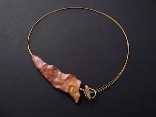
Necklace for a book faery, haunting the stacks of The Library.

I'm very proud of this piece-- the clasp-in-front style necklace, this time from my wabi-sabi collection. I love that I've finally managed to get a torn edge to be strong enough to use in jewelry-- delicate and textured as though a it's a leaf from an old, old book, but the resin makes it really quite sturdy. As you can see, I haven't managed to fully get into spring mode yet-- I'm still really into these deep, rich, reddish earth shades. The 24k gold leaf makes it perfect.

Thursday, January 1, 2009

Happy New Year, everyone! I'm back! Actually, I've been back for a few days. It just takes me a while to get back on track again after travel.

Visited the mall with my mom the weekend after Christmas-- no crowds, I'm sorry to say. I don't like mall crowds, but it would have cheered me up a bit to witness one this year. Alas, no. Anyway, I got to see the spring fashion collections in action. Yech. The colors are indeed the ones in the Pantone Color Report 2009, but what they've done with them! Not for me. Too much bright and not enough neutral, in my opinion. Instead of a neutral with pops of color, it's more like fields of eye-straining color with a tad of neutral to be searched out if you can bear to look long enough.

Everyone's a critic, I know. I've been playing with the same colors, but the neutrals temper things a bit in what I'm doing so far. My neutral of choice for the spring is soft grey, livened up with pops of spring green, yellow, tangerine. Fun, but not painful. Maybe I'm still in a winter mood (why would that be? Just because it's early January?!).
For your delectation, here's a mosaic pendant in the new colors: